Stay informed with our newsletter.


EN


Explore how branding trivia and user behavior data shape effective campaigns. Color drives snap judgments; enduring brands evolve without losing identity; logo refreshes boost clarity. Consumers log seven hours on screens, with video dominant. Mobile generates most retail traffic, while social media sways purchasing. People favor interactive, personalized content and trust authentic, consistent messaging; diversify formats to beat fatigue. The takeaway: combine data-led strategy with memorable storytelling to capture attention, convert, and build lasting loyalty.

Branding isn’t just a logo or a jingle, it’s the sum of tiny cues that nudge us toward trust, desire, and action. At the same time, user behavior is shaped by habit loops, social proof, and the ever-present glow of a screen. Put the two together and you get a playbook for modern marketing: creative ideas guided by data, and data brought to life through storytelling. Below, we blend bite-sized trivia with hard numbers and fresh examples to help you build brands people notice and remember.
Color psychology still rules first impressions.
Over 90% of snap judgments about products are driven by color alone. That doesn’t mean there’s a single “best” hue, it means consistency and context matter. Red can signal energy and urgency (hello, Coca-Cola); blue often conveys trust (think: banks, SaaS dashboards); green cues calm, nature, or savings. The trick is to pick a palette that reinforces your brand’s positioning everywhere, on packaging, in product UI, on thumbnails, and in in-store displays.
Longevity comes from evolution, not stasis.
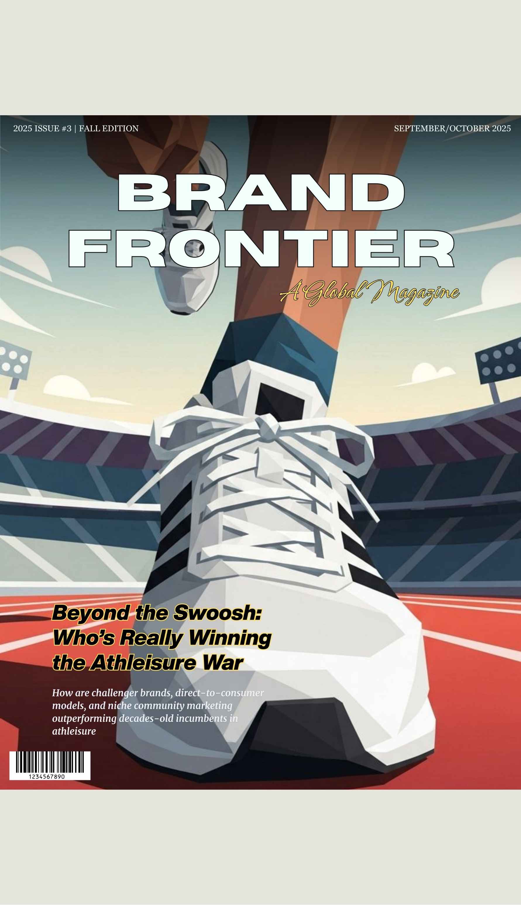
Iconic brands like Coca-Cola, LEGO, and Nike are case studies in “change without confusion.” Coca-Cola’s script hasn’t wavered, but campaigns, from “Share a Coke” to seasonal activations. keep the story fresh. LEGO continuously expands into film, gaming, and adult collector sets without losing its creative play DNA. Nike updates typography, layout, and tone for new channels while preserving the Swoosh and “Just Do It” mentality. The lesson: keep your core, refresh your expression.
Logos don’t have to shout to speak loudly.
Most modern refreshes are subtle: refined typography, simplified shapes, better legibility at small sizes. Why? Because your logo now lives most often as a favicon, an app icon, a social avatar, or a tiny corner on a video. Optimize for clarity at 16×16 just as much as a billboard at 16×9. When in doubt, trim details, boost contrast, and test across dark and light backgrounds.
Sound is a brand asset too.
From Netflix’s “ta-dum” to Intel’s five-note mnemonic, sonic signatures accelerate recognition, especially in short-form video. If your content strategy rides on Reels or Shorts, a distinctive sting or loop can become a memory shortcut.
Packaging is the new homepage.
In e-commerce thumbnails and unboxing videos, the pack is a stage. Distinctive shapes and repeated motifs create “shelf interrupts” on tiny screens. Designers increasingly prototype packs as they’ll appear on a mobile marketplace carousel, not just on a physical aisle.
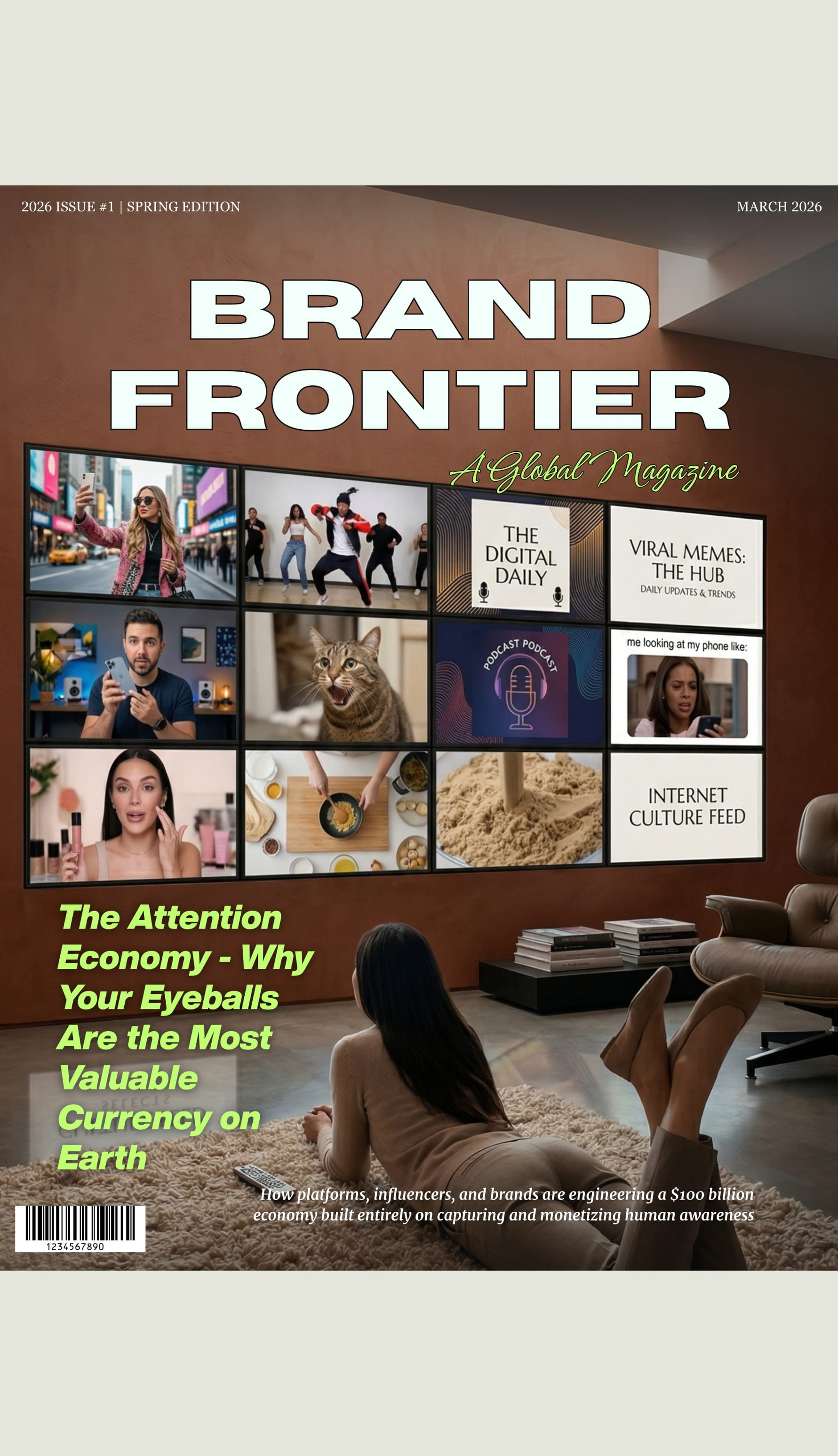
Screen time is the default context.
Average daily screen time globally now exceeds 7 hours, with video dominating engagement. That means your brand message must be legible at a glance, caption-friendly, and memorable with the sound off and on. Prioritize first-second clarity (logo lockups, bold headlines) and narrative arcs that pay off in under 10 seconds while hinting at a deeper story for those who stick.
Mobile runs the retail funnel.
In top markets, mobile shopping drives nearly 75% of online retail traffic. The implication isn’t just “make it responsive”, it’s “design mobile-first everything”: scroll-stopping hero images, autofill-friendly forms, one-tap wallets, and SMS or WhatsApp follow-ups. Product pages should surface proof fast (ratings, UGC photos, succinct FAQs), and checkout should be ruthlessly minimal.
Social proof drives persuasion.
Over 60% of consumers say social media influences purchase decisions. Influencers matter, but so do micro-signals: creator reactions, before/after clips, live Q&A, and comments that surface objections (“Will this fit?” “Is it washable?”) answered promptly and publicly. Turn those answers into persistent assets, carousel slides, pinned comments, or quick cuts in retargeting ads.
Attention is spiky, not steady.
Users flit between platforms and formats, generating rapid content fatigue. To sustain interest, diversify angles (how-to, behind-the-scenes, myth-busting, customer stories), not just channels. Rotating creative pillars beats posting the same ad frame in five places.
Privacy reshapes behavior.
As tracking tightens and consent walls rise, users reward brands that are transparent and offer value exchanges: early access, exclusive content, useful utilities (size calculators, recipe builders), and easy data controls. First-party relationships (email, SMS, loyalty programs) are rising in importance.

Personalization works best when it reduces friction.
“Hello, [Name]” isn’t the point; removing steps is. Recommend sizes based on past purchases, show replenishment reminders before customers run out, and pre-sort categories based on their browsing pattern. If personalization saves time, it feels like service, not surveillance.
Trust is cumulative and fragile.
Trust builds when brand promises match the lived experience. Fast shipping is great; accurate ETAs and proactive updates are better. Clear return policies beat clever copy. Feature real employees and real customers; let your CEO answer tough questions on camera. When mistakes happen, acknowledge, compensate, and narrate the fix.
Authenticity = Consistency × Specificity.
Consistency across channels reduces cognitive load; specificity (your founder story, your craft process, your community) makes you memorable. Avoid generic “values” unless you can show receipts, initiatives, numbers, and outcomes that prove you mean it.
Design for thumb-stopping moments.
Start videos with motion or a compelling reveal. Use tight framing on faces or product details. On static posts, front-load meaning in the first three words of the headline. On pages, keep the primary action above the fold and repeat it after key proof sections.
Treat community as a product.
Host recurring moments that fans can anticipate: weekly tips, drop countdowns, challenges, or UGC spotlights. Reward creation with reposts, discount codes, or exclusive access. Communities thrive when the brand is the stage, not the star.
Trivia and statistics aren’t party tricks; they’re shortcuts to practical strategy. Color shapes first impressions; consistent assets build recognition; subtle logo refreshes protect equity in a world of tiny screens. Meanwhile, users live on mobile, swim in video, and lean on social proof. They crave speed, clarity, and authenticity and they reward brands that respect attention and earn trust.
For marketers and brand builders at BBRM, the mandate is clear: combine data-informed rigor with creative storytelling. Prototype for the small screen, measure what matters, and narrate your values with receipts. When numbers guide strategy and stories carry meaning, you don’t just win clicks, you earn loyalty.
Key Takeaway: Data-informed creativity is the ultimate combination for impactful branding, where numbers guide strategy, and storytelling connects emotionally.
For questions or comments write to contactus@bostonbrandmedia.com


-v3.jpg)


-v3-02.jpg)


.jpg)


